Radiobutton
This widget features a variety of radiobutton style types that are primary colored by default or the selected color.
This widget supports a special style for disabled state.
Radio (default)
The default widget style features the traditional radiobutton which has a round indicator. The indicator is filled with the default or selected color when in a selected state.

# default radiobutton style
Radiobutton()

# secondary colored radiobutton style
Radiobutton(bootstyle="secondary")
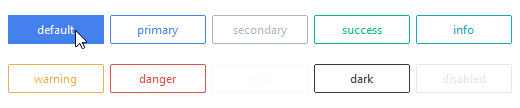
Solid toolbutton
This style features a solid rectangular button that has a muted gray background when not selected and a default or selected color when selected or active.

# default toolbutton style
Radiobutton(bootstyle="toolbutton")

# danger colored radio toolbutton style
Radiobutton(bootstyle="danger-toolbutton")
Outline toolbutton
This style features a rectangular button that has an outline when not selected and a solid background when selected or active.
# default outline radio toolbutton style
Radiobutton(bootstyle="outline-toolbutton")

# info colored outline radio toolbutton style
Radiobutton(bootstyle="info-outline-toolbutton")
Other radiobutton styles
Disabled radiobutton
This style cannot be applied via keywords; it is configured through widget settings.
# create the radiobutton in a disabled state
Radiobutton(state="disabled")

# disable a radiobutton after creation
rb = Radiobutton()
rb.configure(state="disabled")